Rightmove

Art direction
•
Visual identity
•
Concepts
•
Visual design
•
Art direction • Visual identity • Concepts • Visual design •
2015
Real Estate
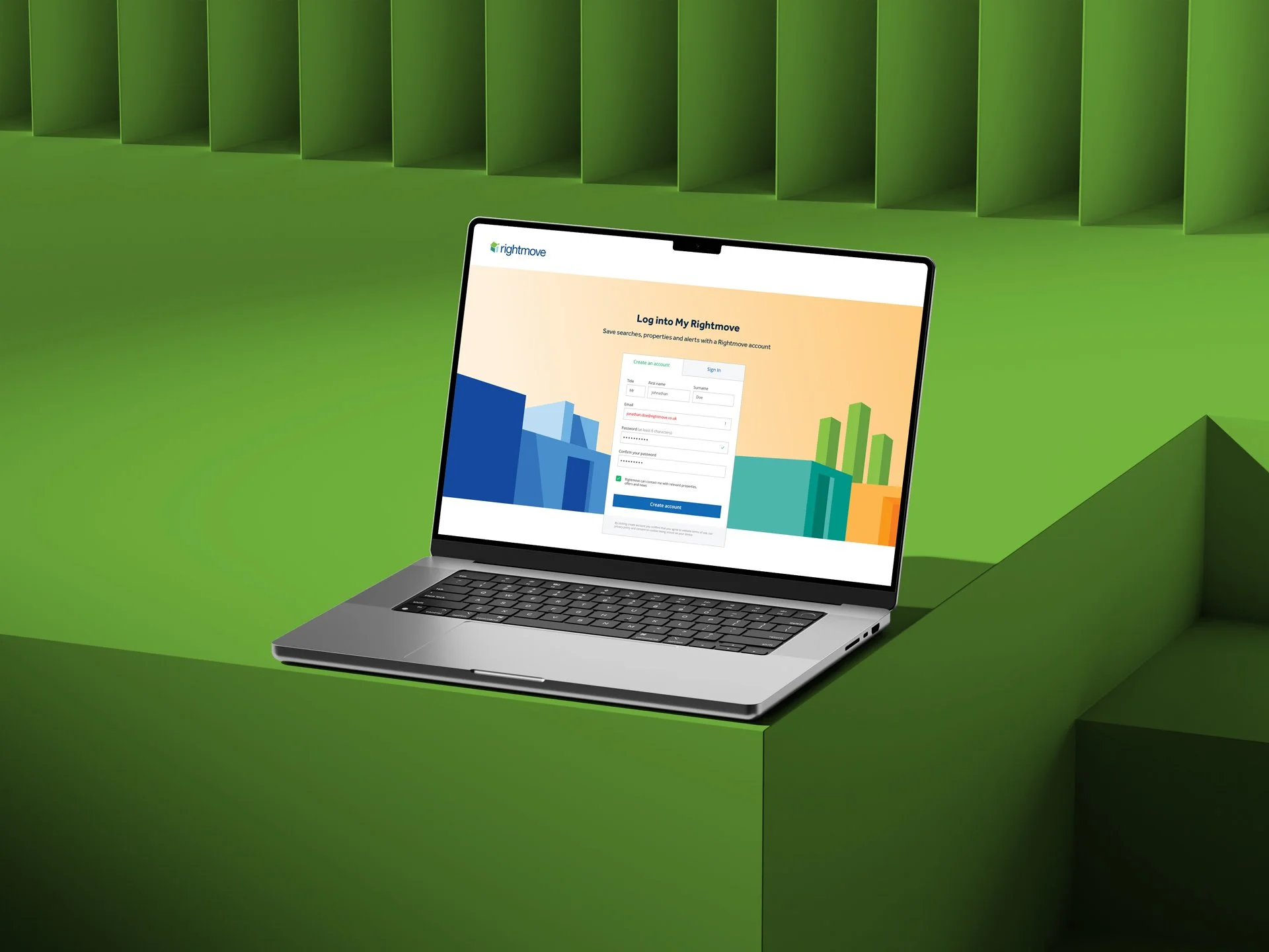
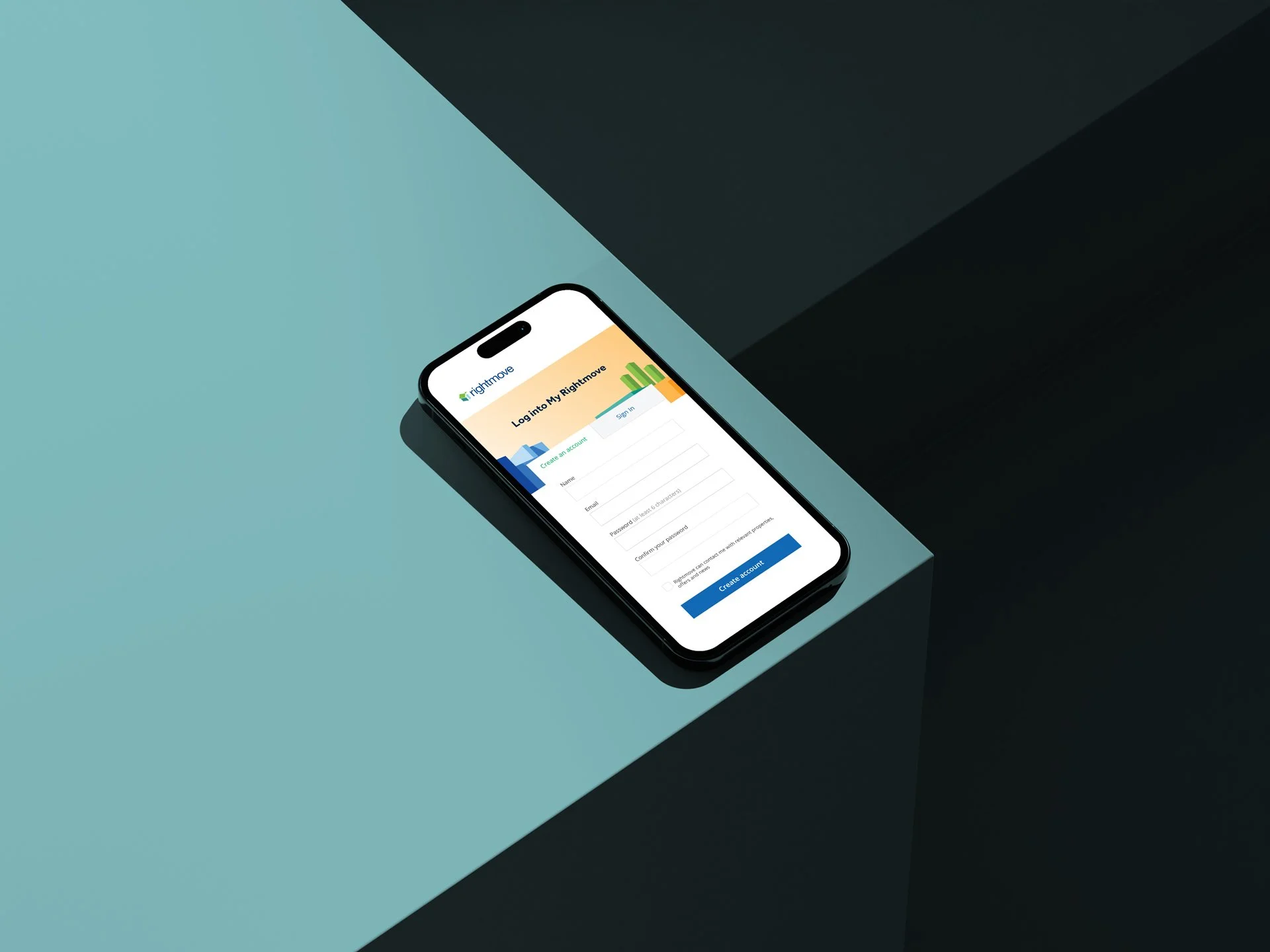
The objective for Rightmove was to define a consistent banner visual system across search, home and sign-in pages, creating a more unified and engaging user experience.
A refreshed secondary colour palette was explored, introducing a vibrant orange inspired by early mood board directions. Following testing alongside existing brand colours, it was adopted as an accent to strengthen hierarchy and improve interaction design, applied across illustrations, calls-to-action and key UI elements.
An abstract illustration style was developed using geometric forms referencing architectural structures. This system created a versatile visual language for digital banners, balancing clarity and visual interest without competing with core content.
The resulting system enhanced overall visual cohesion across surfaces while reinforcing the brand’s role in helping users navigate a fast-moving property market.